 UAE & GCC
Blue Mosaic with Speckled Gold Detailing for a San Francisco Home
A custom blue feature wall for a sunny Californian home.
Monochrome Blue Mosaic Design
To work in monochrome is to gamble on the power of depth over variety. In our latest installation, we traded the multi-color palette for a single color-drenched mosaic, proving that a curated hue can hold more narrative than a full spectrum of décor.
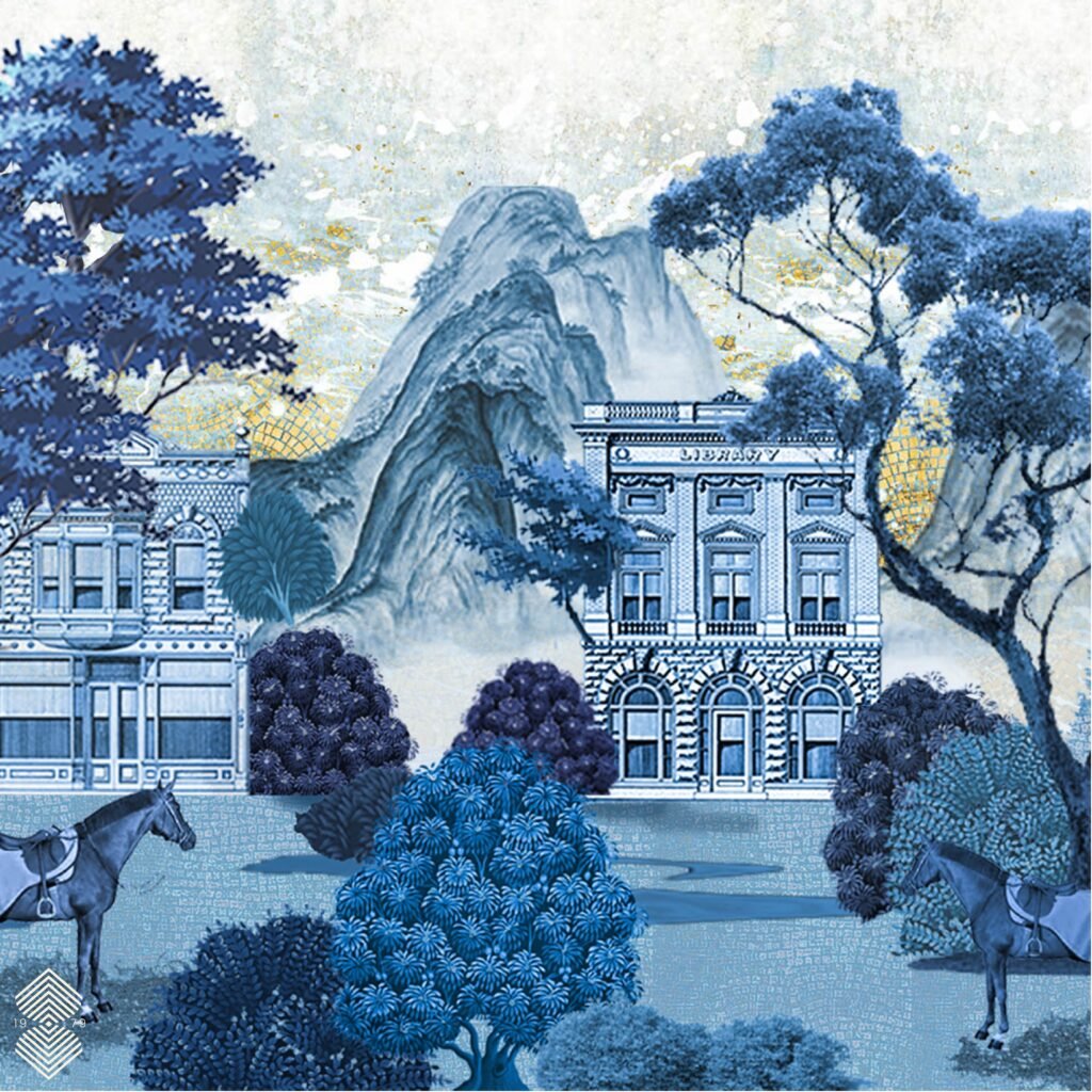
For this 2026 commission in a private San Francisco estate, our goal was to manifest a dreamscape that felt both deeply rooted in the city’s Victorian heritage and elevated by a surreal, misty atmosphere.
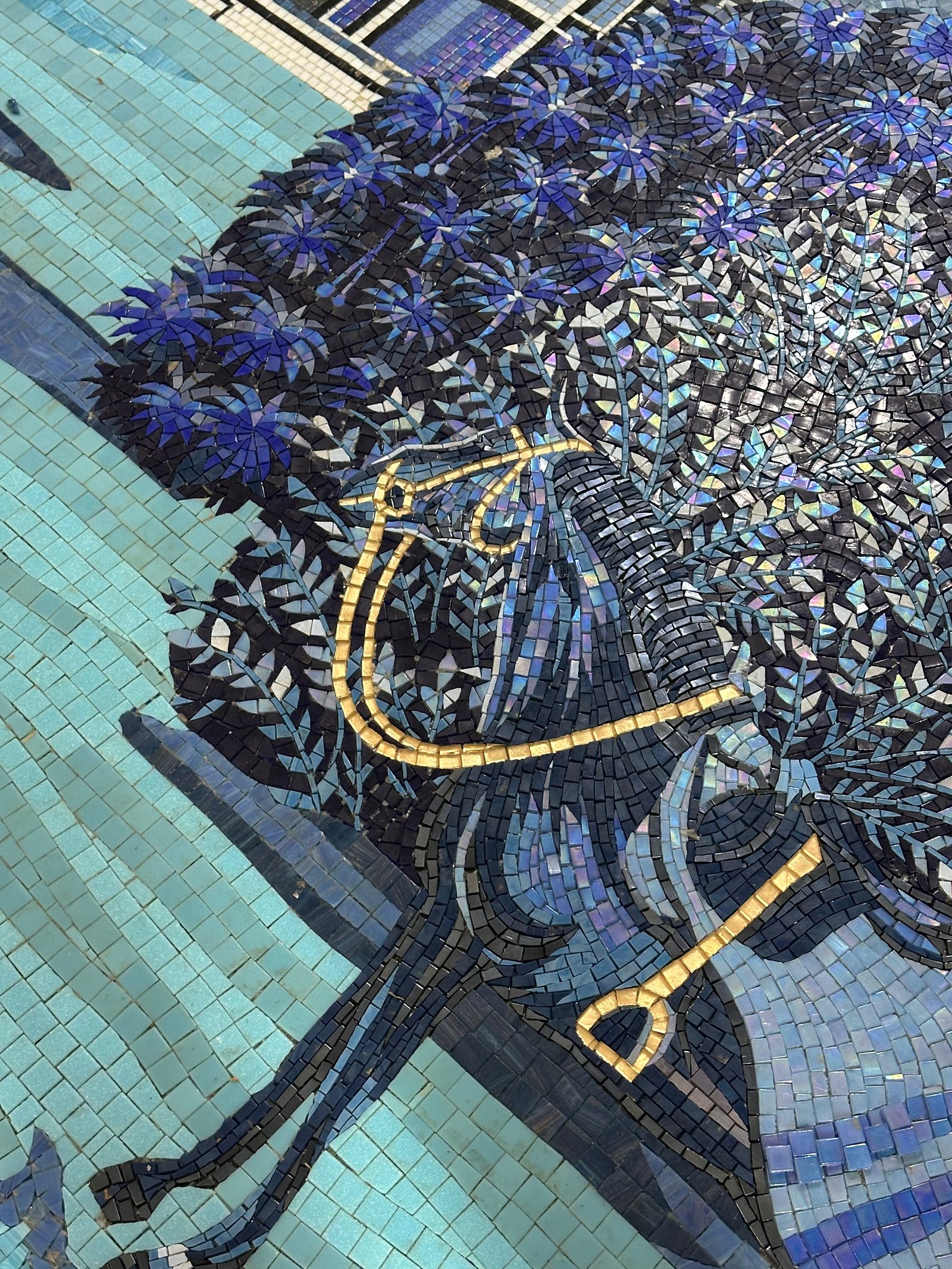
The resulting mural, titled “In the Quiet of Blue,” is a narrative told through thousands of hand-cut glass tesserae.
Vision Behind the Design
San Francisco is a city defined by its light—the way the Pacific fog rolls over the Twin Peaks, turning the redwood-lined streets into a soft, monochromatic blue. The vision behind “In the Quiet of Blue” was entirely conceived by our team at MEC, who set out to capture that ephemeral “Blue Hour” and freeze it in glass. Before moving to production, every idea, shade, and composition was carefully developed and refined in our studio, ensuring the design felt cohesive and true to our concept.
Key elements of the design included:
- Exploration of shades and textures of blue to create depth without additional colors
- Integration of subtle gold accents in select, less noticeable areas
- Sample creation and client review to confirm textures, finishes, and tonal balance before production
The greatest trick of the interiorist is the conquest of the vertical plane. To treat a wall as a solid object is a missed opportunity; to treat it as a portal is an art.
Our latest monochromatic mosaic challenges the physical limits of the room, dissolving the drywall into a sapphire-washed horizon that suggests the house doesn’t end where the floorplan says it does.
Most interior design treats tiling as a background element—something to complement a sofa or a rug. In this West Coast residence, “In the Quiet of Blue” was positioned as the primary protagonist. By utilizing a monochromatic blue palette, we created a sense of “quiet” luxury.
Design Process
A project of this scale requires a marriage of high-tech planning and old-world craftsmanship, which is why our custom design process was well-suited for the client’s requirements.
Phase 1: The Digital Blueprint
Before a single tile was nipped, our design studio created a hyper-detailed Digital Drawing (as seen in the project images). This allowed the client to approve the exact “San Francisco Blue” shades and the architectural proportions of the “J.H. Eller” signage. This stage is crucial for ensuring that the final physical product matches the homeowner’s psychological vision for the space.
Phase 2: Hand-Assembly in the Studio
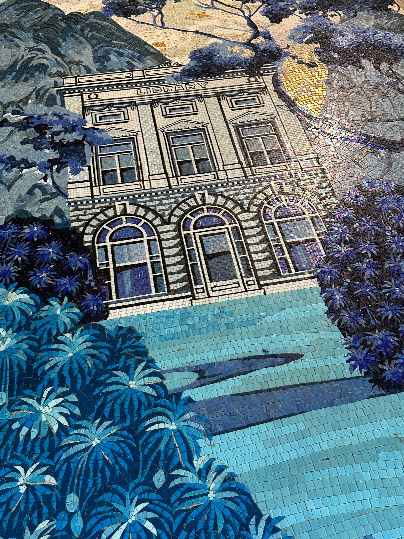
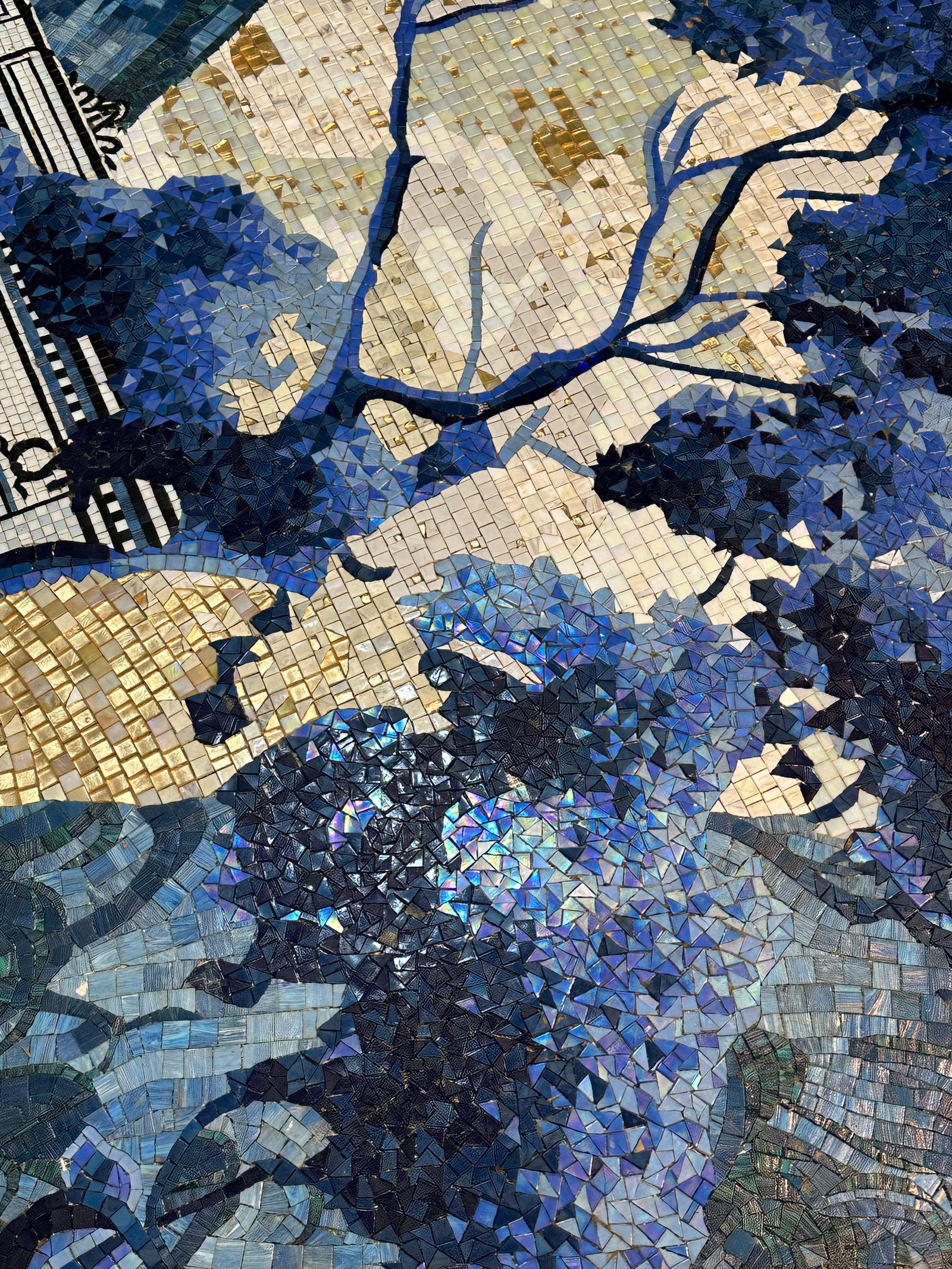
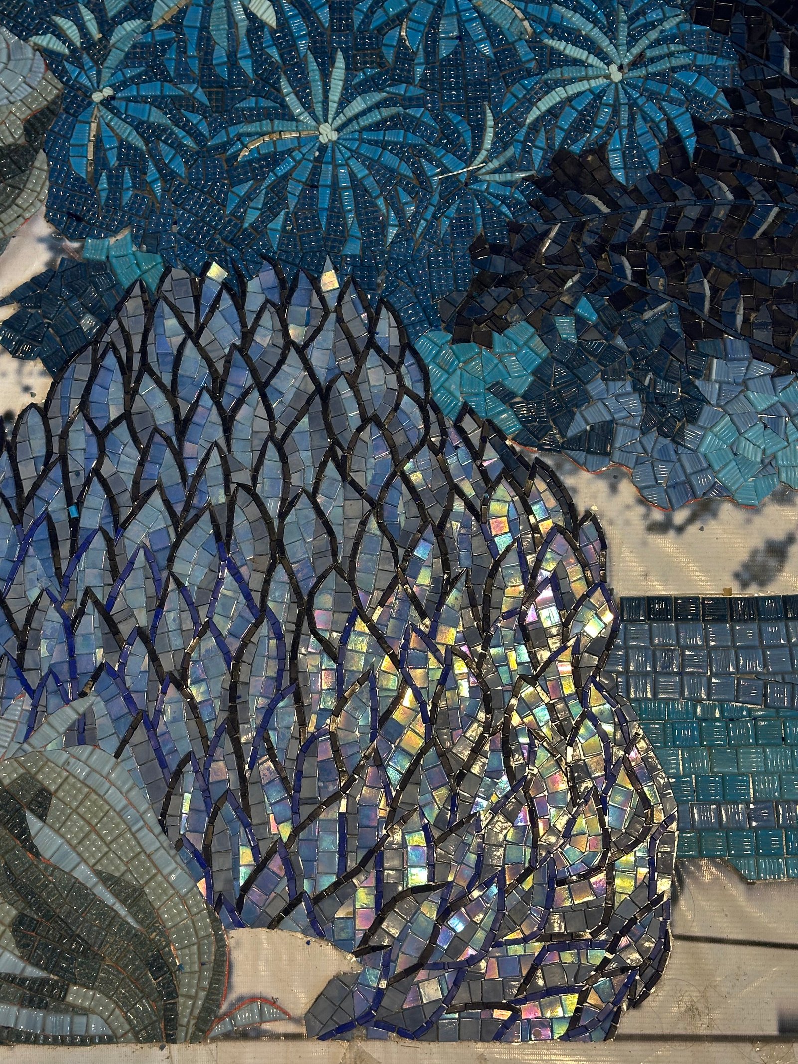
Once the design was finalized, the fabrication shifted to our workshop. Here, our artisans hand-placed every single tessera.
Precision Signage: Look closely at the “Library” and “Hardware” lettering. These were crafted using tiny, pixel-like glass fragments to ensure the typography remained crisp and legible from across the room.
The Gradient Effect: To achieve the misty mountain look, we blended over 40 shades of blue, moving from deep midnight navy at the base to a pale, translucent azure at the peaks.
Phase 3: The Seamless Installation
Shipping a massive glass mural to the West Coast requires surgical precision. “In the Quiet of Blue” was divided into custom-mapped, numbered sections. We provided the local San Francisco contractors with a detailed installation guide, ensuring that the seams between the mountain peaks and the building cornices disappeared entirely.
Designing a Visual Language in Blue
When the installation was complete, the transformation was total. The homeowner remarked that the mural felt like it had always been part of the house—a “permanent art installation” that elevated the property’s architectural value.
Unlike wallpaper that peels or paint that fades, “In the Quiet of Blue” is a legacy piece. It is UV-resistant, moisture-proof, and designed to retain its brilliance for decades. It is a testament to the fact that when you combine cultural storytelling with technical excellence, you don’t just renovate a home—you create a masterpiece.

A Lasting Impression
Through our well-established delivery channels, we are able to send projects like this safely to clients all over the world. As our design team reflects on this project, they note that the real magic was in exploring how a single color—blue—could feel alive and layered, showing that depth and emotion can be achieved even within a restrained palette. Seeing it come together for the client reminded us how thoughtful design and careful craftsmanship can transform a space into something truly special.
FAQs
Can a mural like "In the Quiet of Blue" be adapted for a pool or outdoor patio?
Absolutely. Because we use non-porous glass and UV-stable pigments, our mosaics are perfectly suited for San Francisco’s coastal climate, whether indoors or out.
How do you handle the shipping of such intricate glass pieces?
We use a specialized “face-taped” or “mesh-mounted” system, divided into manageable panels. Every crate is custom-built to ensure your art arrives in San Francisco exactly as it left our studio.
Can we incorporate our own family history or local landmarks into a similar design?
That is our specialty. Whether it’s a specific San Francisco street corner or a cherished memory, we can translate any narrative into a bespoke mosaic.
What makes a mosaic “high-end” or luxury?
Attention to detail, quality of materials, custom design, and craftsmanship distinguish high-end mosaics. Every piece is tailored to the client’s space and vision.
How do remote clients experience the design before installation?
Through physical samples, digital mock-ups, and sometimes live video walkthroughs of the assembly, clients can interact with the materials and understand the effect before anything is shipped.
Bring Your Vision to Life with Custom Mosaics
Contact us today to design a custom mosaic that reflects your vision, blending sacred art and exceptional craftsmanship.